An organization’s mission and vision statements are one of the most important components of an organization, communicating its values, beliefs and reason for existing.
Mission and vision statement hold significant weight in illustrating the positive impact an organization intends to make on the world. Mission statements focus on the present endeavor and vision statements interpret future goals. Both should inspire and engage audiences to become apart of the cause.
Contents
Here are a few clever mission statement pages created by nonprofits.
Take a look at how they empower readers to take action.
Center for Community Change
The Center for Community Change mission/vision statement page is both eye catching and informative, using a combination of infographics and traditional text to draw attention to their goals and activism within the community. The infographic keeps readers engaged in the cause by using bold colors and images. This leads audiences towards the text which informs them of the organizations cause.
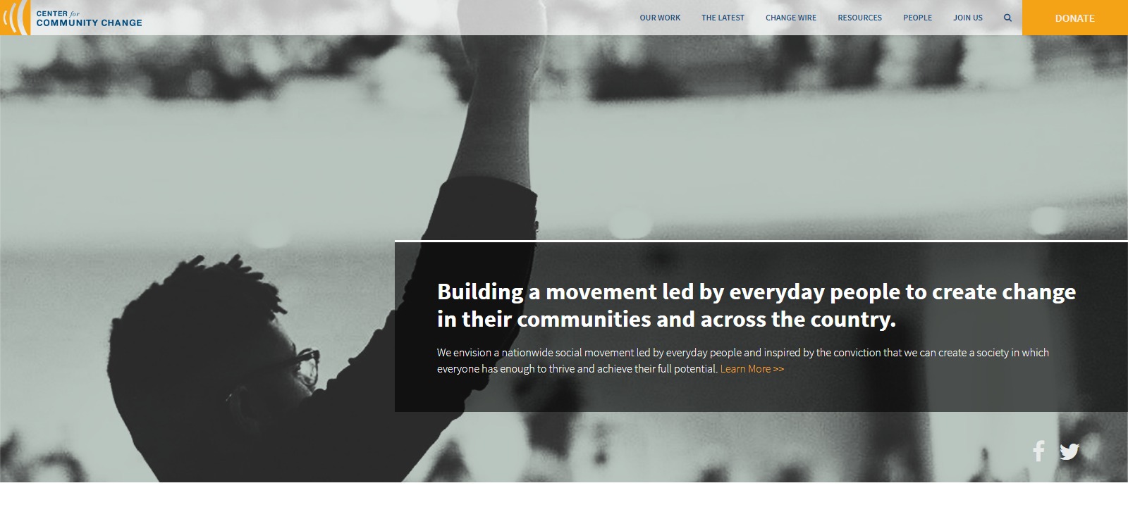
It’s important to have engaging and concise text to support whatever infographics are provided. This ensures that the mission-statement page communicates it’s intents clearly and in multiple ways.
FINCA
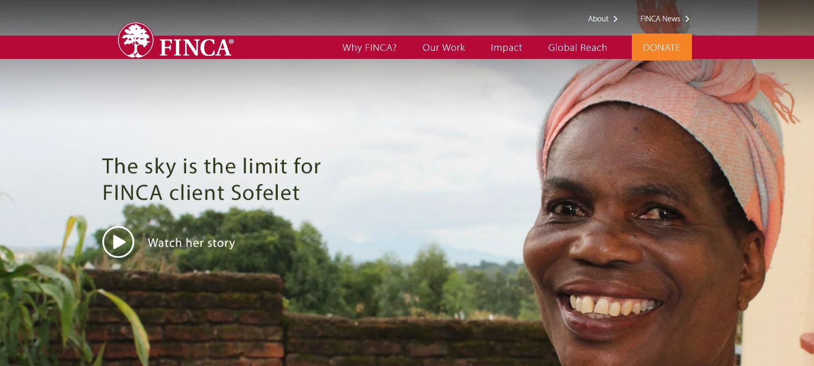
Having images that transcribe emotion to readers is an excellent strategy to create an engaging mission/vision page. According to FINCA their mission is to provide financial services to low income entrepreneurs. We can see this displayed through the photo on their mission page in which the reader views the organization communicating and working with many of these entrepreneurs. This is another way in which images serve to illustrate FINCA’s dedication to their cause.
Hope Unlimited for Children
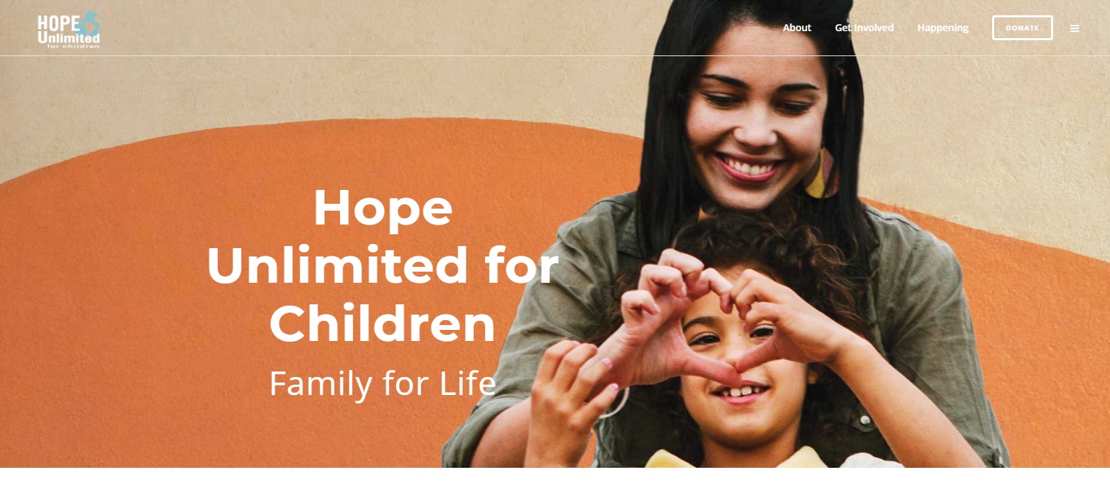
Having an esthetically pleasing website design is a smart way to convey your brand’s mission. The children’s camp Hope Unlimiteddoes an excellent job of demonstrating this. With a mission to transform the lives of children, the camp’s vision-statement page is combines visuals—both image and video—in addition to text specifically designed to target both youth and parents.
The Trevor Project
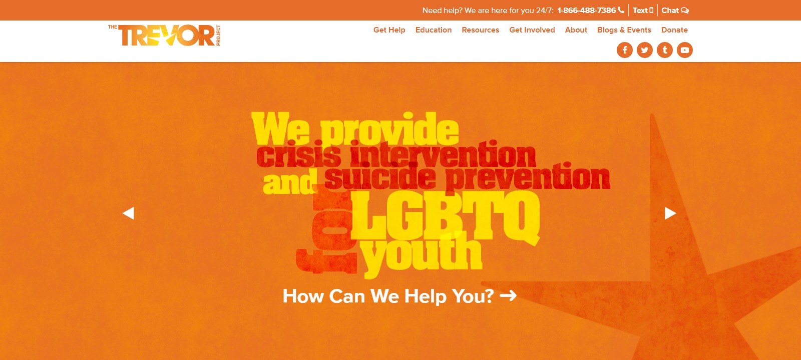
Taking a slightly different but no less effective approach, the Trevor Project uses its typography to illustrate the urgency of their mission to end suicide in the LGBTQIA community. Sometimes with a topic as serious as this there is no need for visuals just call-to-caution text that informs and educates the reader of your cause.
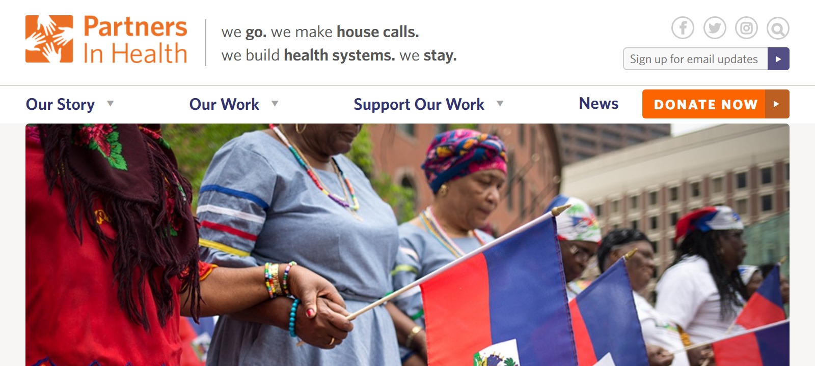
Partners in Health
Partners in Health’s mission can be heard loud and clear through their beautifully crafted mission statement aimed at providing preferential options for the poor. They pride themselves on serving as an antidote for despair. The page uses a single, large image to draw attention to the interactions between doctor and patient, which the color scheme and textures utilized are meant to invoke feelings of nostalgia and hopefulness.
If you’re looking at your own page and thinking that changes need to be made then you’ve come to the right place. Seattle Web Search specializes in fine tuning—or as the case may be, creating from scratch—websites for nonprofits which don’t just embody all qualities of a fantastic website, but engage the audience to ensure that you get the traffic you need to accomplish your mission.


