
Designing a website or even just certain aspects of a website can seem like a daunting task. There are a lot of factors to consider when it comes to web design, but, as long as you don’t make things too complex and know the basics of how to pick the best fonts for your website, you can easily give your website a coordinated and fresh look.
Contents
Popular fonts on the web:

Things to consider when choosing a font for your website:
1. Choose Web-safe fonts because they are faster
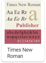
Another super important factor is picking your font is whether or not it’s web-safe. Web-safe fonts, in simple terms, are fonts that, when used online, cause faster loading times than fonts that are not web-safe. Part of the reason for this is that web-safe fonts are typically fonts that most people already have installed on their computers, such as Arial or Times New Roman. If a site uses a font that isn’t installed on your computer, it has to be replaced by a default font, which not only wastes time but is usually aesthetically unappealing.
You might think that the small amount of time that a web-safe font will save isn’t that big of a deal, but the amount of time it takes for your site to load has a shockingly large effect on traffic as well as conversions. According to Unbounce, even a 100-millisecond delay in a website’s loading time can decrease conversion rates by 7%. This, in short, means that the best fonts for website design and utility are definitely web-safe with little to no exceptions.
Google wants you to have a fast website, if your website is too slow when Google sends someone to it they are much more likely to leave.
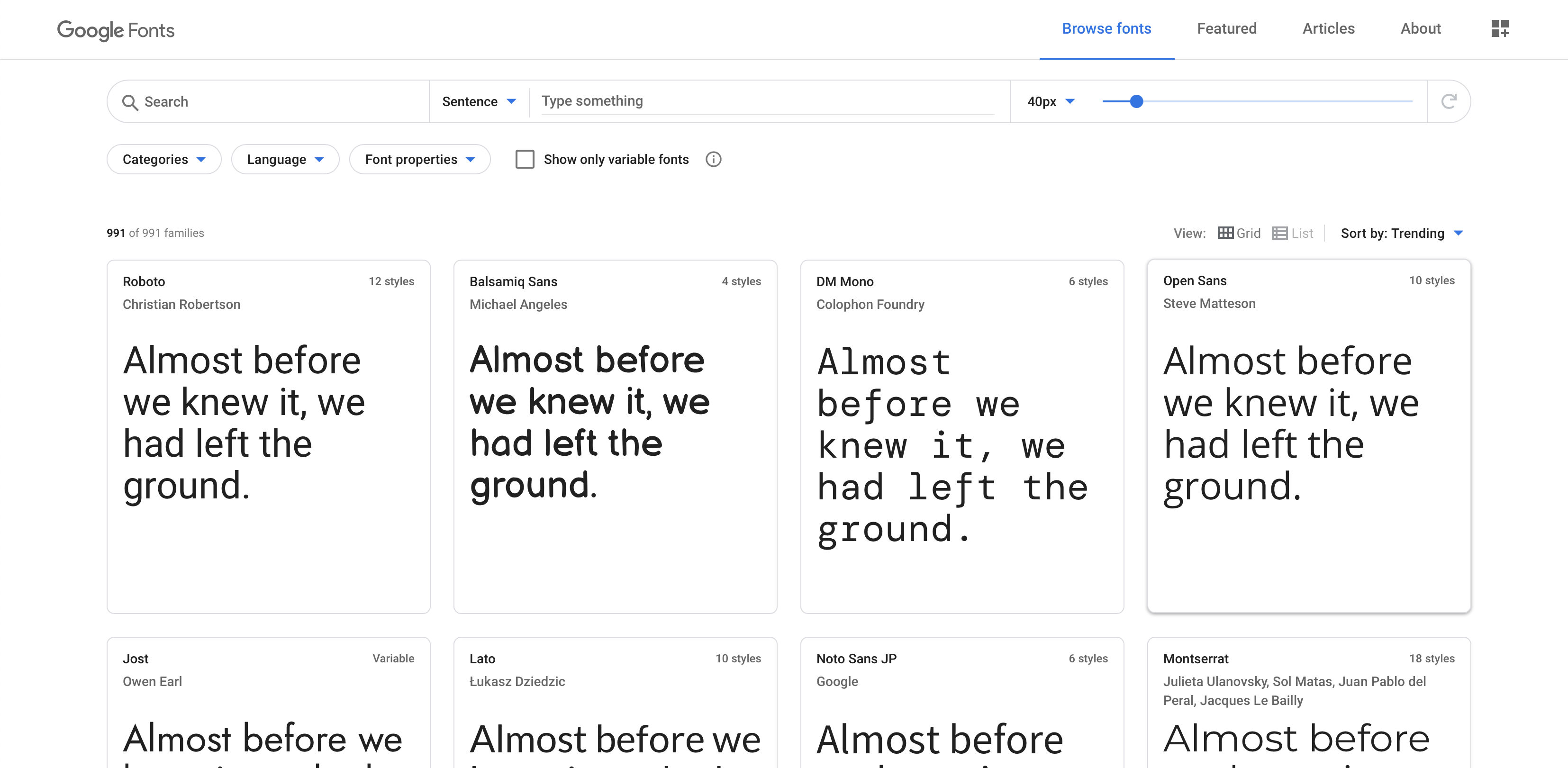
Google Fonts is a great resource for finding fonts that are both pleasantly readable and perfectly web-safe.
2. Use less than 2 fonts
Consistency is key to a well-designed website. You want your website to look cohesive throughout so that everything feels related and put-together. A big part of this is the fonts you use. As a rule of thumb, don’t use more than 2 fonts. Ideally, you want to stick with one font and use different font sizes, boldness, etc. to differentiate titles and headlines.
When writing copy for your site, there are 3 components that usually require different attention to their text: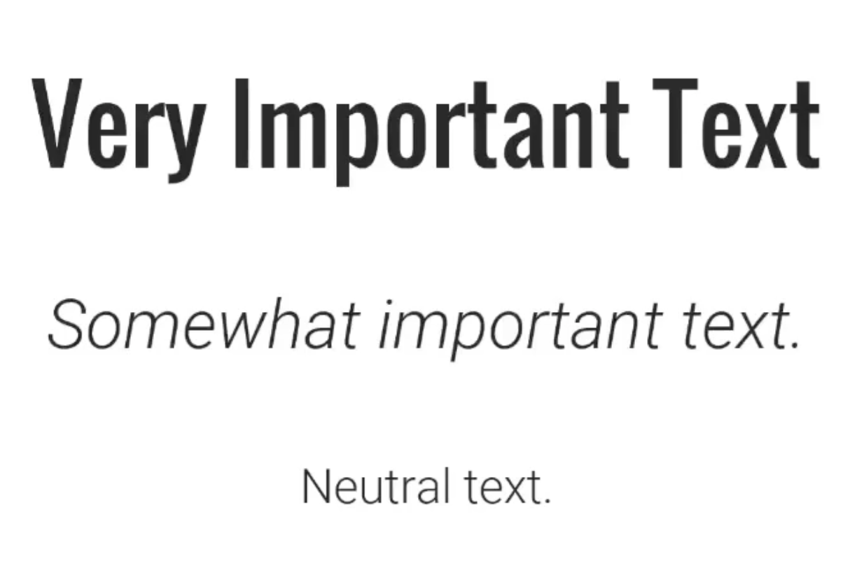
- Very important text
- This is most often applied to your headline(s). It should be stylistically different from the rest of the text and should stand out immediately to the reader. The simplest way of differentiating this type of text is by increasing its font size.
- Somewhat important text
- This usually applies to subheadings or key points and/or quotes in your paragraph text. The simplest way of differentiating this type of text is by bolding or italicizing it.
- Neutral text
- This is any copy that doesn’t immediately need to catch readers’ eye, or, in other words, usually your paragraph text. This is typically just your chosen font without any added effects.
3. Don’t use flashy fonts
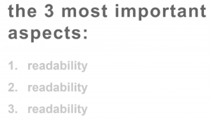
It can be tempting to use flashy fonts with curly or stylized lettering to catch peoples’ eyes, but this is actually a big mistake. Sure, flashy fonts may catch someone’s eye initially, but what keeps that attention is readability. The words might look cool, but if it takes too much effort to read them, readers are going to bail.
In fact, readability is your main goal when choosing a font. In most cases, this means that the simpler a font is, the better.
There are online resources with several examples of safe, readable fonts.
While learning about web design is no easy task, these font tips should help you get a head start in designing websites that are readable, aesthetically appealing, and keep readers’ attention.