
There are a lot of dos and don’ts of graphic design. A huge part of these rules is knowing the basics of how to build website color schemes. Having a base-level knowledge of modern color design can easily give your website a pleasing, coordinated look.
Contents
Color Schemes
Less is More
As a basic rule to create nearly fool-proof color schemes: pick a color, then add black and white. This may sound boring, but, in reality, it’s a helpful guide to a sleek, minimalist design. It can be difficult to gauge what colors look good together unless, of course, two of the colors are black and white.
With that being said, your third color still needs to meet a few guidelines. The color shouldn’t be neon nor anything that might strain the eyes. The third color should also be the color used the least.
If your business has a logo, you should make the logo’s color scheme similar, if not the same, as your website’s. This will not only create a nice sense of consistency for those who visit your site, but it will help make your brand a lot more recognizable. Companies have even copyrighted colors, such as Coca-Cola red or Tiffany blue, and it wasn’t for no reason.
If you don’t have a logo to work off of, there are many color-pickers online that can help you find a usable color that you like. Some examples are:
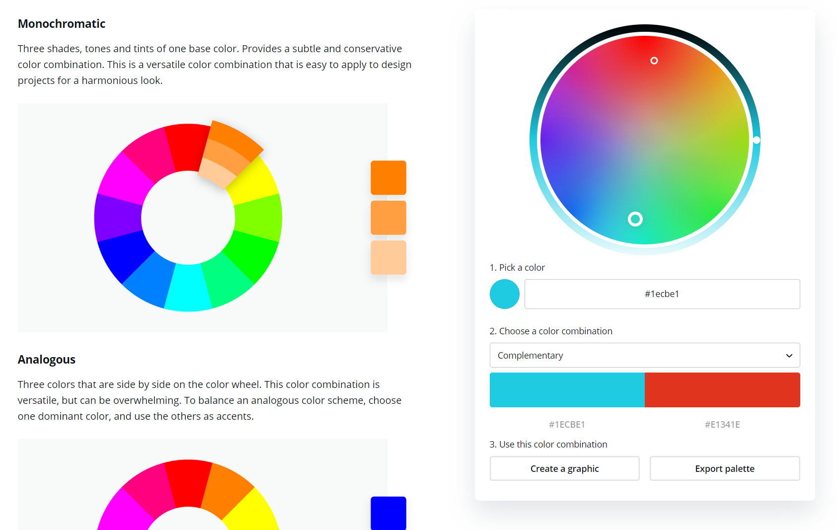
This site has a cubical color wheel that allows you to pick any color. It gives you options for different types of color harmonies you’d like and generates them for you. It also offers explanations for the different types of color harmonies. Finally, it gives you various methods to digitally recreate the colors, such as the RGB and CMYK values.
This site lets you upload an image and then take the color of any part of the photo. It then generates a palette of complementary colors. This could be useful in coordinating the colors of logos or images you plan to use on your site.
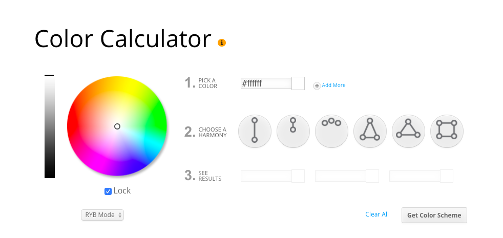
Sessions College Color Calculator
This site has the same features as the HTML Color Codes Color Picker, but with a circular color wheel. The detailed explanations of the different types of color harmonies are replaced by an explanation of how to use the tool itself.
The Canva Color Wheel also contains a color wheel, a color-harmony-selector, and detailed explanations of those color harmonies. However, it only has RGB values. Canva’s most unique feature, however, is that it can take your chosen color scheme and show you examples of uses of similar color schemes.
Research shows that 62-90% of snap purchase decisions are driven purely by the perception of colors.
Choosing the right website color scheme is what makes it memorable, trustworthy, attractive, and profitable. The first impression is everything.
When building a site, you should consider carefully which colors to add to your color scheme and why. Different colors will send different messages to your visitors, changing their understanding of your website, even when it wasn’t intended.
Choosing the right website colour scheme is what makes it memorable, trustworthy, attractive, and profitable. The first impression is everything. In a 2012 study, nearly 2,000 men and women were asked whether they preferred purple, blue, green, yellow, orange, red, or pink. 42% of men said blue was their favorite colour, followed by green (25%) and purple (12%). Women also said blue was their preferred colour (29%), followed closely by purple (27%) and green (19%).
Use Contrast to Your Advantage
Another common mistake is using colored text or colored backgrounds for text. You should put black text on a white background, and not the other way around. This looks the best and is the easiest on the eyes.
Visitors’ attention and the importance of content are other ways to use contrast. Using the third color (the one that’s not black or white) will catch people’s attention first. Therefore, the stuff you want people to pay the most attention to should be in the same vicinity as color.
Learning about web design is no easy task. These tips should help you get a head start in designing website color schemes that are both aesthetically pleasing and able to convey what your business wants to convey.
To learn more about web design, check out the other articles in this series, such as this article about fonts in web design.