
One of the most important things to keep in mind when building a website is your user base. Which demographic(s) is your website trying to target? How familiar are they with technology? How can you make design choices that will convey information to them in the most efficient way possible? How easy is your site to navigate? These are all questions that need to be kept in mind and answered when it comes to practicing UX, or user experience, design because, as the name implies, UX design is about making the experience of your website the best one possible.
However, just reading these questions doesn’t really get you anywhere. One of the best ways to learn is through example, so here we’ll look at some examples of websites that are practicing UX design and explain what’s working and why.
Contents
1. Duolingo
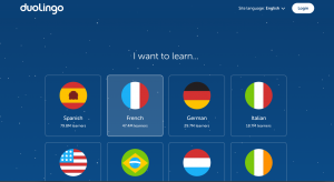 Duolingo is all about making learning (specifically, learning languages) fun. The interface makes this clear with its friendly, approachable interface and images. It makes the daunting task of using a website to learn a language seem doable.
It doesn’t force you to make an account to try their service, either. You can dabble in its workings within seconds of reaching the website. This gives users a chance to make sure they enjoy the platform before committing to making an account.
Duolingo doesn’t stop at getting you to join, either; the way that the language learning process is presented follows the same trends as the rest of the site: approachable and easy to understand. Some other great features are a progress bar to give a sense of progression and answers being reinforced with colors or sounds depending on whether they’re correct.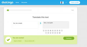
2. Virgin America
The Virgin America website is a complete 180 from the typical, clunky airline websites that many buy their plane tickets from. The site has a clean, modern sheen and, instead of trying to sell you credit cards and upgrade packages, the main user goal, booking a flight, is the number one priority.
The site also proves to be user-friendly in other aspects, such as the large, easily-readable text, and the main interface consisting of a calendar. It also has an option to browse flights based on price rather than date, making bargains easy to find for those with flexible travel dates. You can also change any of the search filters without having to start the search from the beginning.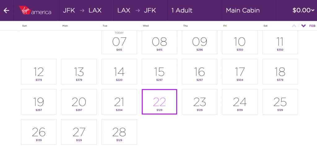
3. Blue Apron
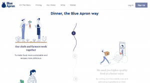 Blue Apron’s homepage is compelling in how it delivers its information. There are small animations throughout that encourage the site’s visitor to interact with different things on the page. It also presents several calls to action that lead you to the steps to purchase Blue Apron’s services.
The signup process is simple, which adds to the appeal. There’s a short questionnaire about food preferences that includes pleasing visuals and positive reinforcement when you answer the questions.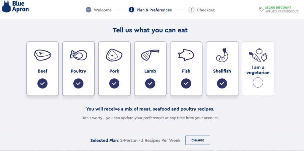
4. The Atlantic
The first thing that hits you when you visit The Atlantic’s website is the number of articles. This makes sense, as most people will be able to find something that interests them at a glance, keeping visitors on the site longer. However, all of this information isn’t just slapped onto the page with careless chaos; there are clear categories and organization in place.
The size, color, and font differences between the articles’ titles, authors, and blurbs are pleasing because it leads your eyes to the information you’re looking for. There is a clear focus on the content.
The article pages themselves are laid out nicely as well. There’s a footer that allows easy access to the homepage, share the article on social media, or proceed to related articles. There’s also an option to change text size, which makes the content more accessible.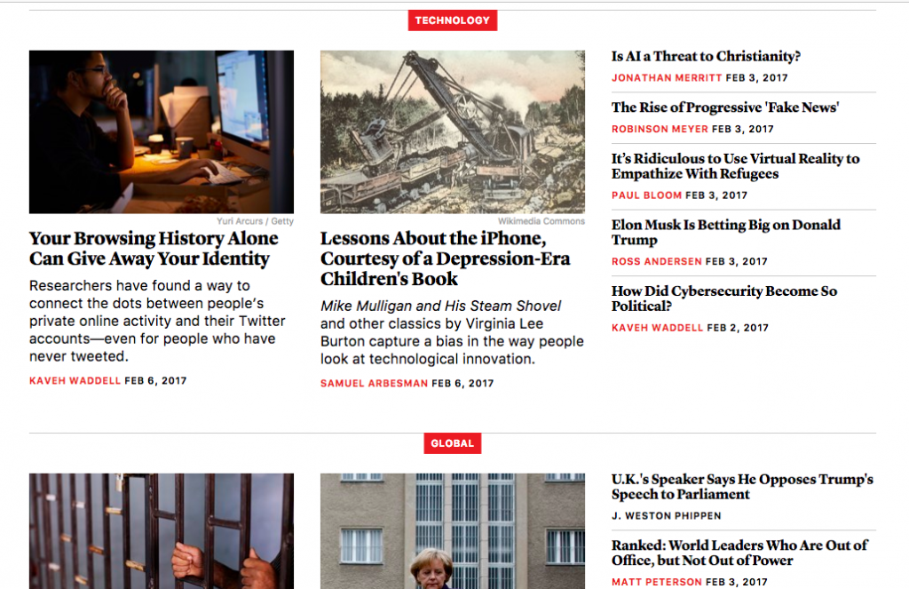
Now that you know how other websites practice good UX, here are some things you can implement on your own site:
- Approachability
- Free trials (if your service allows)
- Simple sign-up processes
- Positive reinforcement
- Clean and sleek website design
- Making the user goal the top priority
- Large, easy-to-read text
- Convenient filter/sort options
- Calls to action
- Aesthetically pleasing visuals
- Mindful organization
Hopefully, these examples of practicing UX design will help you in endeavors, whether you’re trying to learn more about design or are planning on creating a website yourself.