Contents
Little things make a big difference on a website. For example, think about website navigation. Structure, labels, and speed have a huge impact on results, especially for traffic and conversions. The easier your site is to use, the higher you’ll rank, and the greater the chance that visitors will become customers. Below are some tips to increase traffic and conversion:
Be illustrative when using keywords
Being illustrative and specific with keywords is the secret to success. “What we do” is not enough to explain what you really do. Use details to make people and search engines understand what you offer. This is where SEO becomes useful. Descriptive labels are relevant to search engines because they attract visitors.
A key place for search engines is the navigation bar. Inserting descriptive labels on it shows Google that the site is relevant. By adding specific products and services to it, you’re showing exactly what your company does and letting viewers know they’re in the right place. Show off your products and services by using Google AdWords to find the most popular phrases and keywords to attract people.
Also, make sure to avoid labels such as “services” and “solutions”. Listing your services on only one page will prevent the page from ranking. By creating an individual page for each product/service offered, your website will garner more SEO and have a better chance of ranking for multiple different topics. Remember, people aren’t looking for general “products” or “services” when searching on Google, so try to be as specific as possible with your keywords.
Too many items on your home page only serve to distract and lower viewers’ attention. Keep your page clean and tidy by using descriptive labels and few links. In order to keep your website’s “authority” with search engines, you’ll need to bind some links on your homepage. Having too many links there will lead to a lack of interest in the interior pages of the website. If your navigation is concise, then more authority will flow to interior pages and increase their chances to rank.
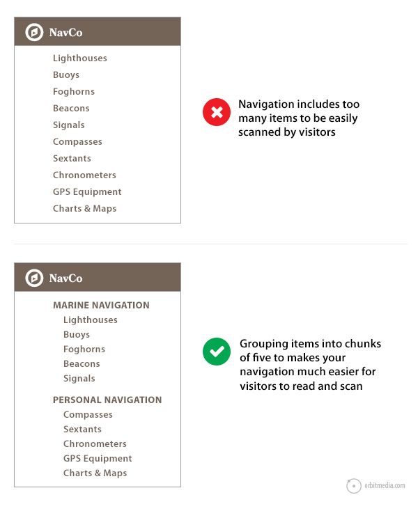
Short-term memory holds about seven items, according to George Miller in his famous Psychology paper published in 1956. Even though the brain uses a method called “chunking” to improve recall in short-term memory, the amount of items depends on the category. Past research has shown this recall is limited to seven items for numbers and five for words.
Aesthetically, more items on your navigation increase the difficulty to remember and process the information for your visitors. Having 8 items instead of 7 may not seem like much, but visually it’s a lot more, and a visitor’s eyes may end up scanning past important items.
If necessary, avoid long lists by grouping five to seven items together. It might be tough to trim your list, but it’s totally worth it. Every time you remove a menu item from a page, everything left becomes more visually prominent and thus more likely to be considered.
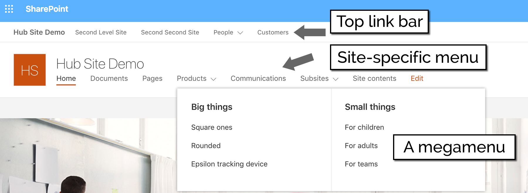
Depending on how they’re programmed, drop-down menus can present problems making them harder to get noticed by search engines. Moreover, usability studies show that visitors find drop-down menus annoying because their eyes move faster than the mouse. By the time the mouse moves to a menu item, people have likely already chosen what to click, rendering further options useless.
The “mega drop-down”, however, is the only type of drop-down menu that performs well in usability studies. This “mega” version offers sundry options and is especially useful if you have a big site with lots of pages and many products or services.
This relates back to always ensuring specificity. Labels like “videos,” “photos,” and “white papers” indicate the format of content, but nothing about the topic, which is exactly what people really look for online. Including specific labels will increase your chance of ranking on Google for that topic, which will in turn lead to more traffic.
Consult your Analytics to place the most important items on the top and bottom of each page
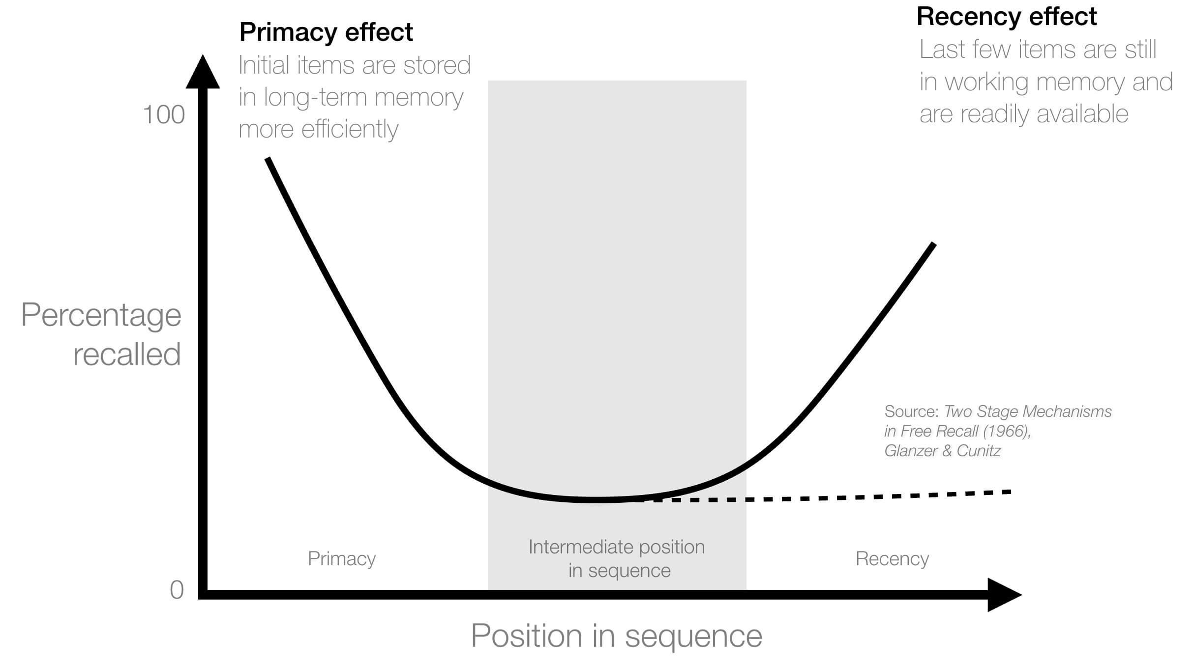
The order items are presented in matters as much as the number of items. Online viewers’ attention focuses on the top and bottom of each page, so strategically place your most important items in these key areas of your homepage. This is the serial position effect and combines with the cognitive biases of the Primacy and Recency effects.
The primacy effect is when items at the start of a list are easily remembered, while the Recency effect is when items at the end of a list of things that just happened are more easily remembered.
If you are not sure which items are most important, check your Analytics. By doing that, you follow the core principle of web design and content marketing: giving visitors what they want to make them give you what you want.
About a month after creating your navigation, you should have enough Analytics to do a bit of “optimization”. Analytics will offer two reports to show which navigation items are most often used by visitors: the “navigation summary” and the “in-page.”
The In-page report displays little orange boxes next to each navigation item with the percentage of visitors that went to each page from any other page. However, this report can often be inaccurate and misleading. The “navigation summary” report does a better job by giving you more precise percentages and a better sense of what’s working within your menu.
These reports highlight which navigation items are often used, so it’s easy for you to remove items that are rarely visited, rename/relabel pages rarely visited, and move the most often clicked items to the beginning.
The homepage isn’t necessarily the entry point for many visitors. A search-optimized website has many entry points, therefore many visitors won’t start from the home page. This makes it all the more important to have a simple, comprehensible navigation system.
Make your website “mobile-friendly”
One study found that 82% of customers utilize mobile phones while purchasing from an online store. Clearly, in order to present the best content across all platforms, it’s essential to make your website as mobile-friendly as possible.
The trend of responsive web design has led to the “hamburger icon”; a graphical shortcut designed to save space on mobile devices. It looks like a hamburger and brings up a menu by clicking on it!
Consistently update your FAQ page
As aforementioned, it’s important to communicate who you are, what you do, and why you do it to potential customers. This practice is important for building trust and thus does wonders for driving traffic and conversions. With an FAQ page, you’re able to present all of your businesses’ most commonly asked questions in one place. FAQ’s are a great way to create more content, as you can make a page for each question. Just make sure all questions are cleanly organized, so users aren’t wasting time trying to find the information they need.
Pro tip: Include a search bar, section titles, and lots of long-tailed keywords. Linking between pages is also helpful; add a “people also ask” at the bottom of each questions’ page to keep them in the funnel of your site. To learn more about how to best optimize your FAQ page for SEO purposes, check out this article.
Bonus Tip: Flexibility
By giving you ideas and suggestions for your menu, we want to emphasize improving the flexibility of your content management system. Change labeling and order, update, and innovate your content. Making navigation easier for both human visitors and search engine robots is the ultimate goal.
Of course, there are exceptions to every rule; so if you’re unsure about making changes, ask an expert web strategist!
Did these tips help? Comment below and let us know if you’ve had success with these tips, or if you want to share some of your own!
I really agree with these points! I think that drop down menus are hard to navigate through, especially if there are a lot of items within a menu. Sometimes, it’s also hard to be mobile friendly with a drop down menu.