
When designing a website, user experience, or UX, is key to capturing attention and keeping people on your website/app. UX design ensures that all the elements of your website appeal to the users and works well for them. The ultimate question you should be asking is “will the user want to come back?”
Contents
Chatbots Increase Customer Engagement and Keep People on Your Website
When users navigate your site, questions are bound to pop up which can be beneficial not only for the customer but to help you improve the site as well. Many chatbots, such as “Julie” from Amtrak, are there for the users right from the start. This ensures that users feel supported throughout their experience and are more likely to stay longer.
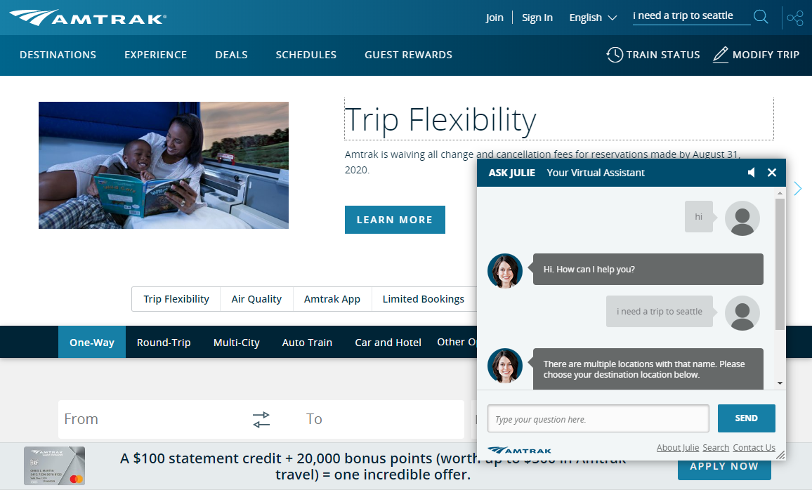
Chatbots make the experience a simple and fun way to take action in a non-traditional way. When websites get confusing, it’s nice to see someone always there to answer any questions users might have. You can engage with your visitors using tools like ChatBot from LiveChat. Choose the type of greeting that works best for you and create your rich greetings. Mix and match: text, images, buttons, and differentiate yourself from the competition while providing high-quality customer service that will turn into hot leads.
Chatbots can strike up a conversation with any customer about any issue at any time of day. They engage in friendly interactions with customers. Besides, virtual assistants only give a bit of information at a time. This way they don’t tire customers with irrelevant and unnecessary information. Chatbots can maintain conversations and keep customers on your website longer.
Scroll Animations: Animate Elements on Your Webpage As You Scroll
A user’s experience is now seen as an actual product, meaning product development is essential. New developments with scroll animations are allowing products to be viewed from the inside out. Take, Apple’s MacBook Pro website, for example.
It starts by showing the core of the product and becomes more interactive as the user scrolls on. Then, you’re taken through the internal and external features that are laid out in a storytelling narrative. Also, they added fun features that even show the MacBook opening as you scroll down. The transitions can “wow” your users and provide a fun, yet informational, experience.

Estimated Read Time Can Increase Engagement With Content
We live in a society with busy people. Everyone’s ready to learn new information but in the shortest amount of time possible, making estimated read time important. Medium was one of the first sites to implement this and it has quickly become one of the best UX design trends.
The average adult can read at about 265 words per minute, but they don’t necessarily feel like they are reading at that rate. They want the information out fast and will often scroll to see how long it will take to read an article. If it looks too long, users often skim the article and leave the page or site. If it says the article only takes a few minutes, they’re more likely to read it.
As explained in the New Yorker:
In 2011, the psychologists Claude Messner and Michaela Wänke investigated what, if anything, could alleviate the so-called “paradox of choice” — the phenomenon that the more information and options we have, the worse we feel. They concluded that … the faster we decide on something, whether it’s what we’re going to eat or what we’re going to read, the happier we become. […] The more we know about something — including precisely how much time it will consume — the greater the chance we will commit to it.
—Attributed to Albert Einstein
When users are on your site, they get the best experience when they are only focused on the content. Being distracted by noises, large advertisements, and other messages are easy ways to turn users away. Many apps are changing their designs to take the users through the process one step at a time. This is one of the main differences between landing pages and any other page on a website (you strip out all the unnecessary information so people don’t get distracted) .
Uber’s UX design takes the users through a linear process of going through each step with simple transitions. This way, the users can feel at ease knowing that all the steps were clear and easy to follow. Linear navigation is a very simple but effective way to improve the user experience for a website or app.
In 2012, tapping a button to Uber across the city felt magical. By the start of 2016, this magic receded to a slew of disparate features that made the experience slow and complex to use. This case study is a great example of how too many features can overwhelm and keeping it simple is often more effective.
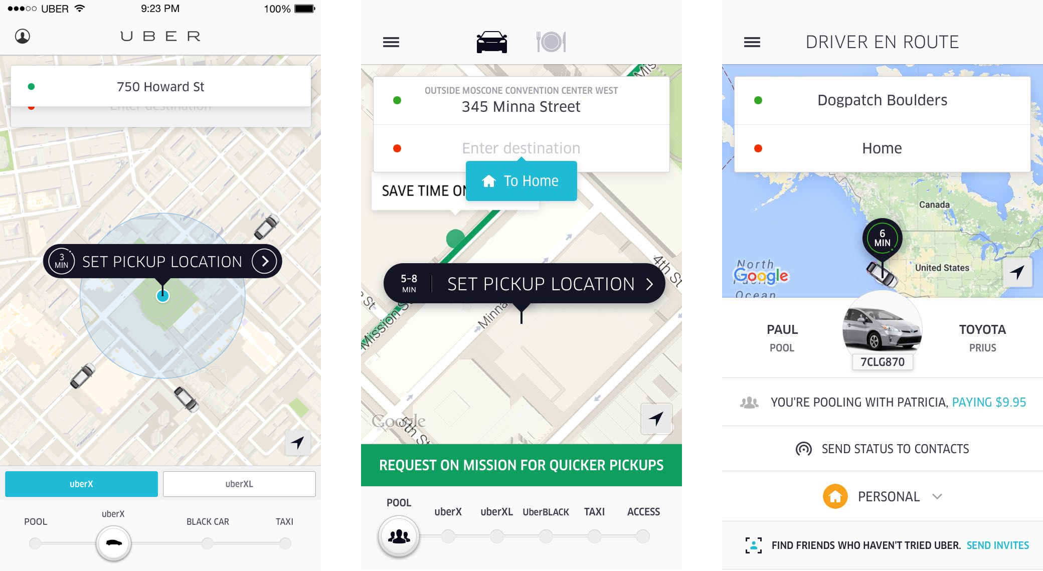
The evolution of the Uber Rider app from 2012 (left) to 2016 (middle and right).
Micro-Interactions Are in Most of the Digital Products You Use (Especially Mobile)
Micro-interactions are actions users take that allow them to give feedback and emotionally react to content. They’re found all over your devices and within apps.
Their purpose is to delight the user; to create a moment that is engaging and welcoming. They can help users visualize how the interface moves or behaves, even though it’s purely digital on a flat-screen.
Web and mobile forms are a common source of frustration for many users. Let’s take the account creation process as an example. Many forms ask for a login/password combination. Quite often, when the user creates this combination and presses the ‘Submit’ button, they get an error message that states that the username already exists or that the password does not meet security requirements (even though those requirements were not previously specified).
Microinteractions are commonly used by big tech (Apple, Google, WordPress, Facebook, etc). This is one of the many tactics Facebook uses to make their product more addictive. Every notification ding, colorful app icon, touchscreen gesture is designed to entice more use.
Mobile apps get a lot more value from micro-interactions because users physically touch the screens with their fingers. Users don’t tap their desktop monitors or their laptop screens, but everyone taps their smartphones because it’s the default state of interactivity.
The Summary? High-quality UX design helps a user feel engaged with the content they’re reading or watching.
For more web design ideas you can read about how Kori Ashton (a WordPress web designer from WordCamp) described UX in web design and SEO, and the tools she uses here. It’s important to keep up with UX design trends in order to attract users, keep them on your website and convert visitors.